Intense debate
Intensity measurements have a particular use, but we shouldn't rely on them as barometers of progress.

When methane emissions are discussed at conferences or in published papers, statements are often made about great progress on reducing the emission of greenhouse gases (GHGs). Charts of GHG emissions are usually offered up to support the statement.
We know that measured levels of methane and almost all greenhouse gases continue to increase in the atmosphere every year. So if we are making such improvements, why aren’t we seeing the results?
One answer is that we aren’t actually looking at the quantum of GHGs being emitted; rather we are looking at various measures of “intensity”.
Intensity measurements are those that divide the methane emission number by another number such as population, energy production, or GDP.
Intensity statistics can be misleading, partly because they involve another number that is also changing, which of course changes the result. For example, if the GDP of a country goes up, the methane intensity number using GDP can come down — even if the methane emitted is rising. Any intensity measure can have the same problem.
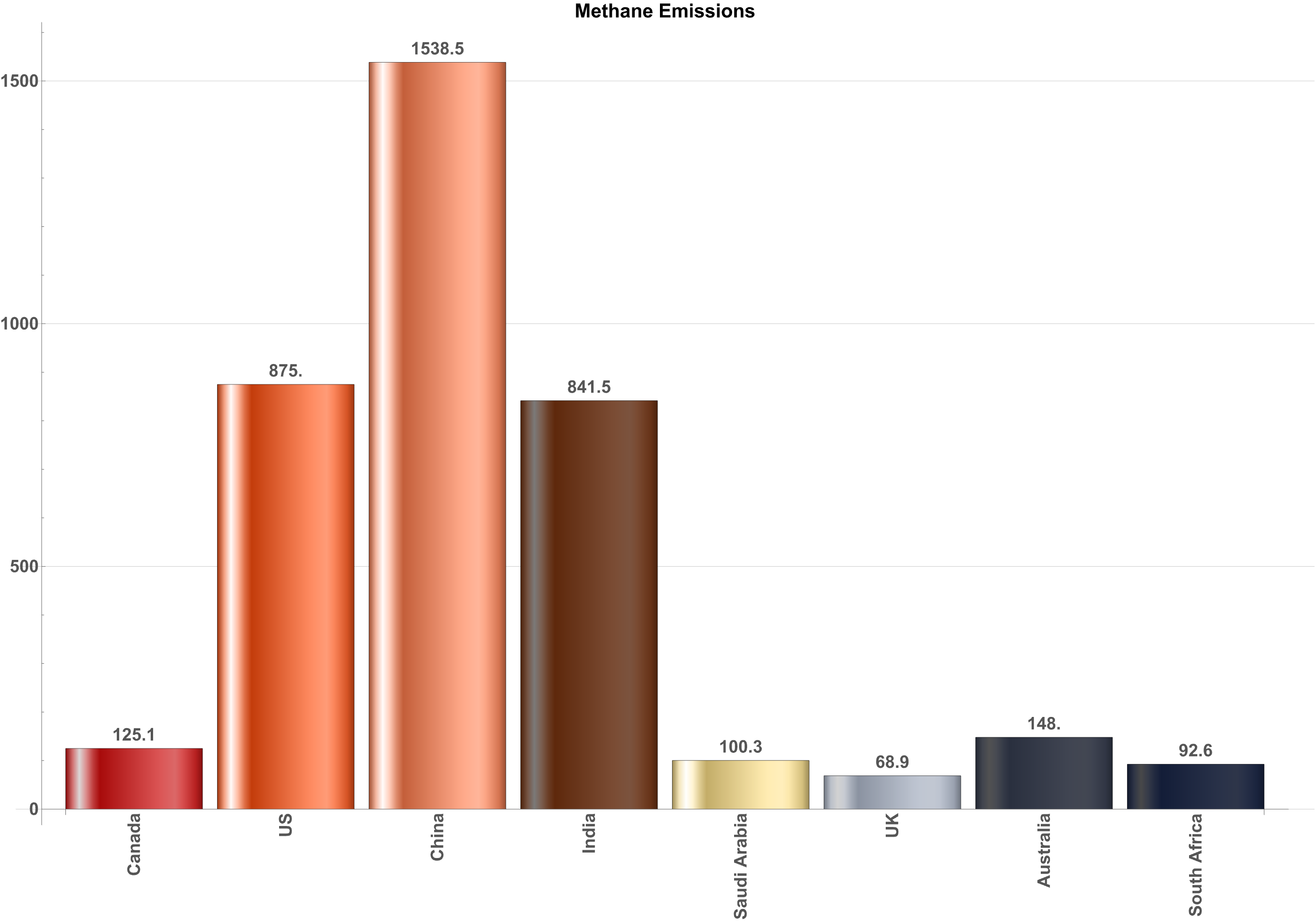
First, consider the International Energy Agency's 2020 chart of methane emissions by country, expressed in megatonnes of CO2 equivalent — not an intensity measure. This shows you the "real world", giving the IEA's best estimates of methane emissions1:

Based on Chart 1, clearly the US, China, and India are the big emitters of methane and they should be focused on aggressively reducing their emissions.
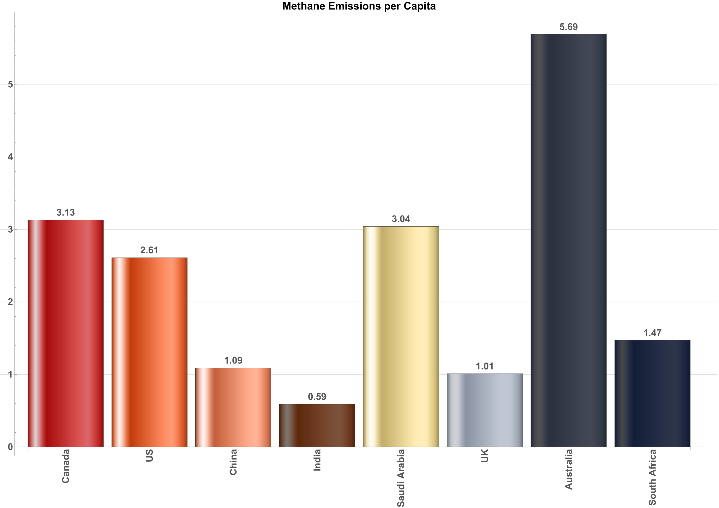
Now, however, look at the per-capita intensity of methane for the same countries (using World Bank data)1, 2:

Wait! Chart 2 shows a different result and suggests a different conclusion. Clearly Saudi Arabia, Australia, and Canada are making a much bigger contribution for every person living in those countries, so they should get focused on methane emissions.

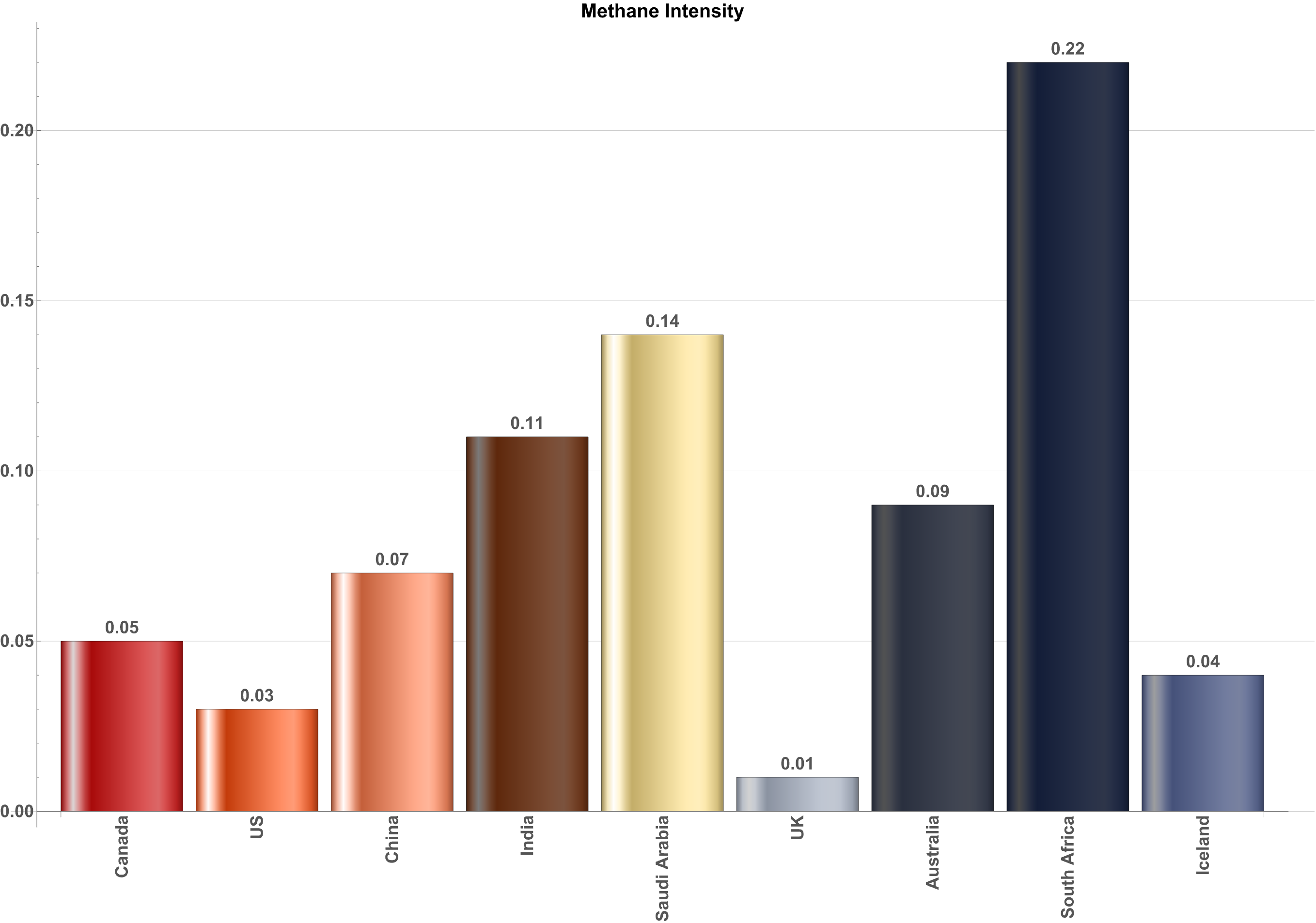
Chart 3 shows1, 2 methane emissions as a function of the size of the countries' economies. Since most human-caused methane emissions occur in such sectors of the economy as oil and gas or industry and agriculture, those countries with high numbers seemingly are not putting enough of the economic wealth they are generating into reducing GHGs.
Either the numbers being cited aren’t right or relevant or the conclusion being drawn is not supported by the numbers.
Reading
- IEA. “Methane Tracker – Data Tools.” Accessed February 4, 2025. https://www.iea.org/data-and-statistics/data-tools/methane-tracker.
- “World Development Indicators | DataBank.” Accessed February 5, 2025. https://databank.worldbank.org/reports.aspx?source=2&country=AUS.
